

Administrator
Author · Jun 02, 2026
Why the most valuable engineering and design investment isn't a feature - it's the infrastructure behind every feature.
There's a point in most product organizations where velocity dies quietly. The codebase still works. The design team is still shipping mockups. But somewhere between the fourth redesign of the same button and the third time a developer rebuilt a modal from scratch, the math stops making sense. Features take longer. Handoffs get noisier. The product starts to look different across platforms in ways nobody intended.
The culprit, almost invariably, is the absence of a shared foundation - a design system.
But "build a design system" is the kind of advice that sounds obvious and scales poorly when examined closely. The question isn't whether to have a design system. It's how to architect one that genuinely compounds value as the product grows, rather than becoming its own form of technical and design debt.
This article examines the data behind design system ROI, the structural decisions that determine whether a system scales or stalls, and the operational model that separates the systems teams actually use from the ones they quietly abandon.
Part 1: The Problem That Design Systems Solve - In Numbers
The case for a design system is often made in terms of consistency and aesthetics. That framing undersells it considerably.
The Hidden Tax of Design Fragmentation
Research consistently puts the proportion of development time spent recreating existing components at 34%. That is more than one in every three hours of engineering capacity spent rebuilding things that already exist somewhere in the organization. At any meaningful scale, this is not an efficiency problem - it is a structural one.
The financial impact compounds. Studies by Klüver, Slack, and Sparkbox found that design teams operating without a shared system spend 34 to 50% of their time on work that a component library would eliminate. Development teams report 31 to 47% efficiency improvements once a mature system is in place. A mid-sized organization with ten developers and five designers can expect to reclaim over 37 months of combined team capacity over a five-year window - translating to more than $1.5 million in saved rework cost alone, before accounting for velocity gains and quality improvements.
The ROI range published by Smashing Magazine's formula - based on empirical efficiency data from multiple organizations - is 135% to 170% over five years. Companies that implement design frameworks for scale report up to $1.5 million in annual rework savings. Those are not abstract projections; they reflect documented outcomes from teams that built the infrastructure before it became a crisis.
The Velocity Argument
Atlassian's design system reduced feature development sprints from two weeks to 3.5 days - a 65% reduction. Figma's internal data science team quantified a 34% increase in design output when teams worked from a shared system, equating to adding 3.5 designers to a seven-person team without hiring anyone. Organizations that have implemented design frameworks to enhance scalability ship features 40% faster while maintaining brand coherence across platforms.
Speed matters asymmetrically in competitive markets. Faster shipping cycles produce more frequent releases, tighter customer feedback loops, and faster iteration - each of which compounds into a product advantage that no single feature can match.
The Brand Consistency Cost
Inconsistent interfaces are not just a design problem. Brand inconsistency leads to a measurable 56% drop in brand recognition. For product companies where the interface is the product, that is not a marketing metric - it is a retention and churn metric. McKinsey's tracking of 300 public companies over five years found that top design performers achieved 32% faster revenue growth and 56% higher total shareholder returns than industry peers. Design-centered companies outperformed the S&P 500 by 228% over ten years.
The link between design system discipline and business performance is not a correlation of vanity metrics. It is the compounding effect of thousands of micro-decisions made consistently rather than randomly.
Part 2: What a Design System Actually Is - and What It Isn't
The terminology is muddled in most organizations and is worth clarifying precisely, because the confusion leads to building the wrong thing.
A design system is the full stack: design principles, design tokens, component library, pattern documentation, code implementations, accessibility standards, governance model, and a contribution process. It is a living product owned by the organization, not a deliverable that gets handed off and forgotten.
A style guide is a subset - brand and visual language documentation covering color, typography, logo usage, and tone. Style guides support a design system but do not constitute one.
A pattern library is a collection of reusable UI patterns and usage guidance. It is typically part of a design system, not a replacement for it.
A component library (in code) is the engineering implementation layer - the React, Vue, or web component equivalents of the design components. Without shared code, a design system exists only as a reference document that developers interpret individually, which reintroduces the fragmentation the system was meant to solve.
The distinction matters because many organizations build a style guide, call it a design system, and then wonder why the problems persist. The style guide governs aesthetics. Only the full system design and code in alignment governs behavior, interaction, accessibility, and the entire developer handoff flow.
Part 3: The Architecture of a Scalable Design System
Not all design systems scale. Many that start with strong intent become brittle as the product evolves - componentized in ways that don't accommodate new use cases, documented for the product that existed at launch rather than the product being built now. Scalable systems share a common architectural logic.
Layer 1: Design Tokens as the Foundation
Design tokens are the lowest-level decision in a design system: named variables for color, typography, spacing, elevation, border radius, motion, and any other visual property that might be shared across the system. They sit beneath components and govern them.
The three-tier token architecture that scales most reliably:
Primitive tokens define raw values with no semantic meaning. color-blue-500: #3B82F6 is a primitive token. It describes what exists, not what it means.
Semantic tokens assign meaning to primitives. color-interactive-primary: color-blue-500 tells the system when and why to use that blue. Semantic tokens are the bridge between brand values and component behavior.
Component-specific tokens handle the edge cases that semantic tokens don't cover - the specific shadow on a tooltip, the transition duration of a drawer open state. These are used sparingly and justified by genuine component-level need.
The practical consequence of this architecture: when the brand's primary color changes, a single primitive token update propagates across every component in the system. Without tokens, a brand refresh requires a manual audit of every screen in every product. The difference in implementation cost is measured in weeks.
Layer 2: Component Architecture Principles
Components in a scalable system are built around two competing demands: consistency and flexibility. Too rigid, and product teams build custom components outside the system rather than adapt to its constraints. Too flexible, and the system stops enforcing the consistency it was built for.
The principles that resolve this tension in practice:
Composition over configuration. Build small, single-purpose components and compose them into larger patterns rather than building large, highly-configurable components with dozens of props. A card component should accept a header, body, and footer slot - not a 40-prop API that tries to anticipate every possible card variant. Composition scales; configuration doesn't.
Variant discipline. Every component variant that exists in the system should reflect a documented, product-tested use case. Variants created speculatively to "cover future needs" add maintenance burden without value. Document the use case first, then build the variant.
Semantic naming. Component names and prop names should describe purpose, not appearance. variant="primary" scales across rebrand. variant="blue" does not. size="medium" survives a design overhaul. size="18px" hard-codes a decision that the token layer should own.
Accessibility as a first-class constraint, not a post-launch audit. Accessible components built into the system propagate accessibility to every team that consumes them. Forrester's research shows well-designed interfaces can improve conversion rates by up to 400% compared to poorly designed ones - a gap partially explained by the accessibility improvements that rigorous design systems enforce. Microsoft's research on inclusive design found that it can increase overall usability by 30% for all users, not just users with disabilities.
Layer 3: Documentation That Actually Gets Used
The gap between a design system with good documentation and one with poor documentation is not aesthetic - it is adoption. Teams don't use what they don't understand, and teams that don't understand the system build outside it, which is exactly the fragmentation the system was built to prevent.
Effective documentation has three mandatory elements:
Usage guidance, not just specifications. A component's documentation should explain when to use it, when not to use it, and which alternative to use instead. Specification alone - the props list, the color values - describes what it is, not how to decide whether it's right.
Live code examples. Static screenshots of components go stale and are disconnected from the actual implementation. Living documentation built in Storybook or an equivalent tool shows the component in its real rendered form, with code snippets the developer can copy directly. The handoff between design and engineering collapses when both are working from the same live source.
Explicit behavior documentation. What does this component do on focus? On error state? On mobile breakpoints? Interaction states are the most common place where design intent and engineering implementation diverge, and explicit documentation closes that gap at the system level rather than in every individual component build.
Layer 4: The Governance Model
This is the layer most organizations underinvest in, and the one that determines whether the system grows or stalls. A design system without governance is a shared library that slowly drifts into inconsistency as teams add to it independently.
The two dominant governance models:
Centralized model: A dedicated design system team owns the system. Product teams submit requests; the system team evaluates, builds, and maintains. High consistency, slower turnaround, requires sustained headcount allocation.
Federated model: Product designers and engineers contribute to the system while maintaining their primary product responsibilities. A small core team reviews contributions, enforces standards, and handles documentation. Faster iteration, more aligned with product needs, but requires disciplined review processes to prevent drift.
For most organizations below ~200 engineers, the federated model is the practical starting point. A basic governing team - one interaction designer, one visual designer, one engineer - can maintain a federated system while individual contributors from product teams extend it.
The contribution process matters as much as the model. Every contribution to the system should answer three questions before it's accepted: Does this solve a problem multiple teams have? Does it follow the token and naming architecture? Does it have documented usage guidance and accessible behavior specifications? Systems that lack a contribution filter accumulate technical and design debt at exactly the rate they would have without the system.
Part 4: The Scaling Inflection Points - What Changes at Each Stage
A design system's requirements change as the product and organization grow. Systems built for ten engineers become liabilities at a hundred if they aren't re-architected for the new scale.
Early Stage (1-3 Product Teams, <50 Engineers)
At this stage, a design system is primarily a shared vocabulary and component library. The goal is not comprehensiveness - it is consistency on the surfaces that matter most: the primary user journey, the core navigation patterns, and the brand-defining visual language.
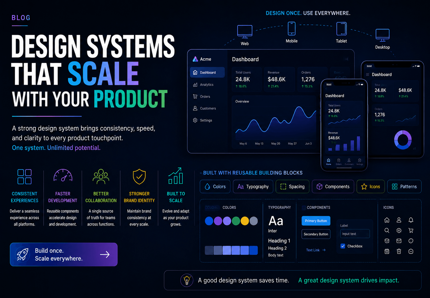
What to build: A token foundation covering color, typography, and spacing. A core component set covering buttons, inputs, modals, navigation, and cards. Basic documentation. A Figma library that mirrors the code components.
What to skip: Extensive governance process, contribution workflows, or exhaustive edge-case coverage. These add overhead without proportional value at this stage. Cover 80% of use cases well rather than 100% of use cases adequately.
The scaling risk at this stage is building components that are too tightly coupled to the current product's specific use cases. When the product expands into new use cases or new platforms, tightly-coupled components force custom rebuilds. Design to the pattern, not the screen.
Growth Stage (3-10 Product Teams, 50-200 Engineers)
At this stage, multiple teams are building simultaneously. The consistency problem becomes acute because the system has to serve divergent product surfaces that didn't exist when it was built - mobile native, a new product vertical, and an enterprise tier with different brand requirements.
What changes: The federated governance model becomes necessary. Token architecture becomes critical because ad-hoc color decisions now proliferate across teams. Documentation quality becomes a velocity issue rather than a polish issue - teams making hundreds of design decisions a week cannot afford to misinterpret components.
The scaling risk at this stage: The system falls behind the product. Teams build custom solutions for use cases the system doesn't cover, and those custom solutions don't feed back into the system. Within 12 to 18 months, the product will contain a shadow design system built by individual teams in parallel with the official one. This is the most common failure mode in growing organizations.
The fix: Coverage tracking. Measure the percentage of new features that are built from system components versus custom builds. 80% or higher coverage is a strong adoption indicator. Below 60% is a signal that the system is not keeping pace with product needs.
Scale Stage (10+ Product Teams, 200+ Engineers)
At this stage, the design system is an organizational infrastructure. It needs versioning, multi-brand support (if the organization has multiple products or white-label requirements), automated accessibility testing integrated into the CI/CD pipeline, and performance budgets for component rendering.
What changes: A dedicated design system team becomes economically necessary. The cost of the team is lower than the cost of the coordination overhead it replaces. PayPal's five-person UX team supports 60+ products and over 1,000 developers using a shared design system with unified components, demonstrating the leverage ratio that a well-resourced system team can achieve.
The critical investment at this stage: Design-to-code synchronization. At scale, the lag between design decisions in Figma and engineering implementation in code is a primary source of inconsistency. Tools like Figma's Code Connect, or design token pipelines built with Style Dictionary, automate the translation of design decisions into code tokens - collapsing the interpretation gap that grows wider as team size increases.
Part 5: The AI Layer - What Changes in 2026
Artificial intelligence is reshaping how design systems are built, maintained, and consumed. The teams that adapt earliest will extract significant efficiency advantages.
AI-Assisted Component Generation
LLM-powered design tools can now generate component code from design specifications, reducing the time between a design decision and an engineering implementation from days to hours. GitHub Copilot, Cursor, and design-specific AI tools can scaffold component implementations from a system's existing token and pattern conventions - not replacing the design system, but accelerating the translation of system decisions into production code.
The practical implication: the maintenance overhead of keeping code components synchronized with design components - historically one of the highest-friction aspects of design system operations - is increasingly automatable.
AI and Documentation
The Design System Documentation Standard (DSDS) - a structured, machine-readable format for documenting design systems covering components, tokens, token groups, themes, styles, and patterns - is gaining adoption as AI tools increasingly consume design system documentation directly. Systems documented in machine-readable formats allow AI coding assistants to reference accurate component APIs rather than hallucinating implementation details - a meaningful quality improvement for engineering teams using AI to accelerate development.
The implication for teams building design systems in 2026: documentation written for humans needs a parallel layer written for machines. This is not a future consideration - it is a current one, given how quickly AI tooling has become embedded in engineering workflows.
AI-Generated Component Variants and Testing
AI tools can now generate and test component variants at scale - generating accessible color combinations that meet WCAG contrast requirements, testing components across breakpoints and screen readers, and identifying visual regressions in component updates. These capabilities reduce the human overhead required to maintain a high-quality, accessible system as the component library grows.
Part 6: The Adoption Problem - Why Good Systems Fail
A design system that teams don't use delivers none of its projected value. Adoption is as much an organizational challenge as a technical one, and it is where many otherwise well-built systems fail.
Research on design system adoption identifies three primary failure modes:
Unclear ownership. When nobody is explicitly responsible for the system, nobody advocates for it, maintains it, or resolves the inevitable disputes about how it should evolve. Design systems without clear ownership drift. The fix is explicit: assign ownership, with accountable individuals for design decisions and engineering decisions, respectively.
Misaligned incentives. Product teams are measured on feature velocity. Time spent contributing to a shared system does not appear in a product team's delivery metrics, even when it reduces the total delivery cost organization-wide. Teams that are measured only on what they ship individually will underinvest in shared infrastructure systematically. The fix requires either an incentive adjustment at the organizational level or a system team that handles contributions on behalf of product teams.
Weak executive sponsorship. Design systems require sustained investment over a multi-year horizon before they return full value. Without executive-level support, they are consistently deprioritized in favor of features with more immediate visibility. The economic case - 135 to 170% ROI, $1.5M in annual rework savings - needs to be presented in terms leadership can act on, not in the language of design maturity.
The organizations with the highest design system adoption share one operational practice: they measure coverage and celebrate it. Tracking the percentage of production features built from system components, publishing that number quarterly, and recognizing teams that increase coverage creates a feedback loop that sustains adoption long after initial launch enthusiasm fades.
Part 7: The Design System Maturity Audit
Before investing in building or restructuring a design system, a structured maturity assessment identifies where the highest-value interventions lie. Here is a five-dimension audit framework:
Dimension 1 - Token coverage: Do design decisions (color, typography, spacing, motion) live in a centralized token system, or are they hard-coded in components and screens? Token coverage below 70% is the most common root cause of rebrand complexity and component inconsistency.
Dimension 2 - Component coverage: What percentage of production UI is built from system components versus custom one-off builds? Measure this per product team, not as a blended average - the distribution reveals which teams are operating outside the system and why.
Dimension 3 - Documentation quality: Can a new engineer understand and correctly implement every system component without synchronous guidance from a designer or senior engineer? If the answer requires qualification, the documentation has a gap.
Dimension 4 - Design-code parity: Is the Figma component library in sync with the code component library? Parity gaps - where design and code diverge - are the primary source of the design-to-engineering miscommunication that design systems are supposed to eliminate.
Dimension 5 - Governance health: Is there a documented contribution process? A regular review cadence? A clear decision-making structure for system-level changes? Governance gaps compound over time; a system without them accrues design debt at the same rate as a codebase without code review.
Score each dimension on a one-to-five scale. The lowest-scoring dimensions are where investment produces the highest return - not always where the organization believes the problem to be.
What Doesn't Scale
Just as important as knowing what to build is knowing what to avoid.
Building the system for the current product only. Every component built to serve one specific screen creates debt when that screen changes. Build to the pattern - the underlying interaction model - not the surface.
Treating documentation as an afterthought. A component without usage documentation is a component that will be misused. Documentation is not polished; it is part of the component's definition of done.
Optimizing for design team efficiency at the expense of engineering usability. A design system that designers love but engineers find difficult to implement produces beautiful Figma files and inconsistent production interfaces. Both sides need to own the system.
Skipping versioning. Once multiple product teams consume a shared system, unversioned updates break things unpredictably. Semantic versioning - major for breaking changes, minor for additions, patch for fixes - applied consistently prevents the coordination overhead that makes teams reluctant to update to the latest system version.
Declaring the system "done." A design system is a product that needs to evolve with the product it serves. Organizations that treat the initial system build as a project with an end date rather than an ongoing capability consistently find that the system's coverage degrades over time as the product outgrows the components that exist.
Conclusion: The Infrastructure Argument
The strongest argument for a design system is not that it makes products look better. It's that it changes the economics of building products permanently.
Every hour spent establishing the shared foundation returns hours across every subsequent feature that uses it. Every accessibility decision encoded in a component propagates across every screen that component appears on. Every brand update applied at the token layer cascades through the entire product rather than requiring a manual audit. The compounding nature of this return is why design-led companies consistently outperform their peers - not because aesthetics drive revenue directly, but because the discipline of building shared infrastructure forces the organizational clarity and cross-functional alignment that quality products require.
The design system is not the deliverable. It is the infrastructure that makes every deliverable better, faster, and more consistent than it would otherwise be.
Build it like infrastructure. Maintain it like a product. Measure it like a business investment.
The teams that do will ship more, spend less, and build products their users trust.
Key Takeaways
- Product teams spend 34% of development cycles recreating components that already exist elsewhere - a structural waste problem that design systems directly eliminate.
- Design teams see 34 to 50% efficiency improvements with a mature system in place; development teams see 31 to 47%. Combined, the ROI ranges from 135% to 170% over five years with documented savings of up to $1.5M annually.
- Atlassian's design system reduced development sprint time by 65%. Figma's internal data equates full design system usage to adding 3.5 designers to a seven-person team.
- Scalable design systems are built in layers: design tokens (primitives → semantic → component), component architecture (composition over configuration), living documentation, and a governance model.
- The most common failure mode is not poor component quality - it is poor governance: unclear ownership, misaligned incentives, and absence of executive sponsorship.
- Coverage tracking (target: 80%+ of production features built from system components) is the single most reliable indicator of adoption health.
- AI tooling in 2026 is compressing the design-to-code translation gap and introducing machine-readable documentation as a new system layer - teams building systems now should architect for AI consumption, not just human consumption.
Building a product that's outgrowing its design foundation? Talk to the Kariux team about how we help product organizations build systems that scale - from the token layer up.